Visualizaction
Take a look to Mobile Price
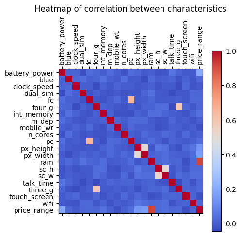
Correlation graph
The correlation graph is used to denote which variables are linearly related. Considering that we are interested in the Price Range variable, its highest and most notorious correlation is with the RAM Capacity. This diagram gives us a starting point on the analysis that can be done
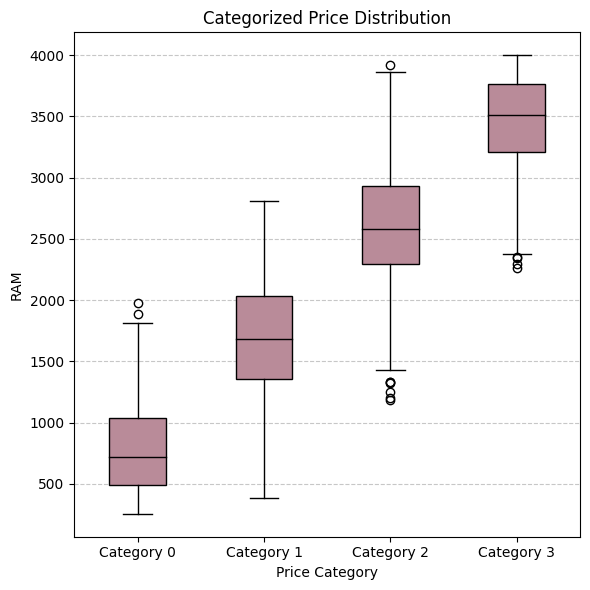
Box-and-whisker plot (RAM vs. Price Range)
This graph allows us to look closely at each of the price ranges, from 0 to 3, and we can see how the data varies depending on the price range. It can be seen how each time the RAM increases, the tendency is for the price of the device to increase, since the averages of the categories are higher
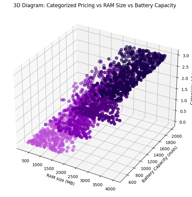
3D Diagram
In this three-dimensional map relating RAM size, battery capacity and price range you can see how a higher price is concentrated as long as the battery and RAM have higher capacity. This visualization of the data is useful to evaluate the factors that affect the price.
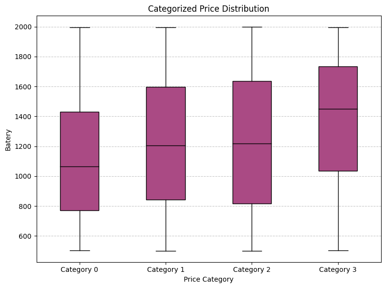
Box-and-whisker plot (Battery vs. Price Range)
In this case you can see how the average battery capacity of each category of data is increasing, this tells us that in general the Price Range increases a little depending on the Battery Capacity of the device.
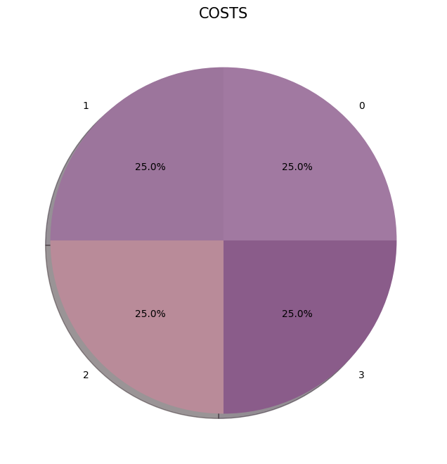
Pie chart
In this case we see that our target is Balanced. So we can use Accuracy metric for evaluationg